
In the course of time, trends of all the spheres of our lives have been constantly changing. And web design is not an exception. Years ago shiny, drop-shadowed gradient pages with masses of clip art were considered a web masterpiece. And what can we see now? Are they still? No. Everything is as flat as it can be.
People don’t want to see clunky fonts or 3-D effect graphics that was the peak of webmaster technologies. Everything has to be bright and sleek. The old designs on the web seem boring and annoying for users’ eyes. Now almost all web templates are flat and as up-to-date as possible. And want to have nothing in common with the older web templates. But is that right? Or should we learn and take something from the better web design examples?
Here are some old web design trends that can be surely supplied to your website, whether you want to make a new move.
Monochrome
Some tones and colors would definitely add individuality, though the mix of black and white would give you more opportunities to personalize your website. While monochrome now will look not so well on websites related to creative sphere as it was years ago with Music templates.
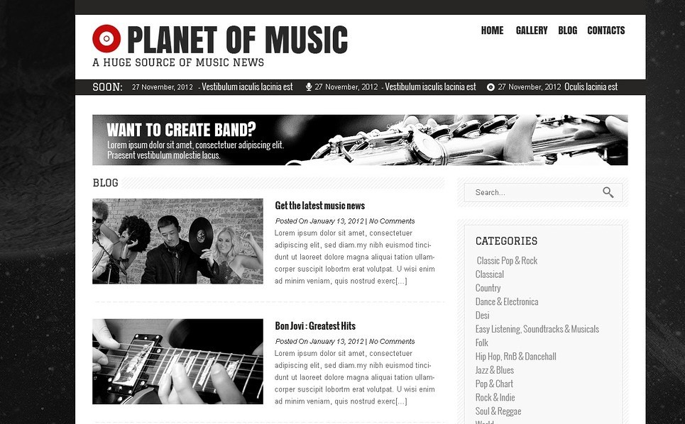
Source: http://www.templatemonster.com/wordpress-themes/41412.html
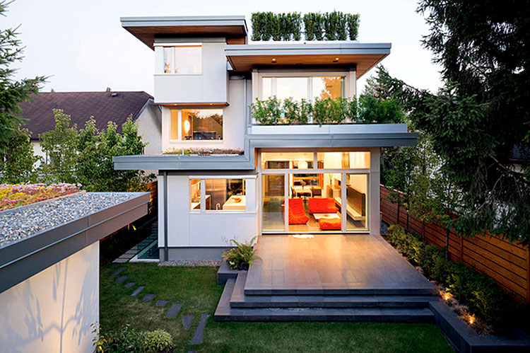
You can easily use it in the business sphere. The monochrome color scheme will focus the attention of your clients on the content you need. And that is quite well for professional needs. The thing that you can do to make it better is to add some colors to monochrome as can be seen in the Real Estate themes.
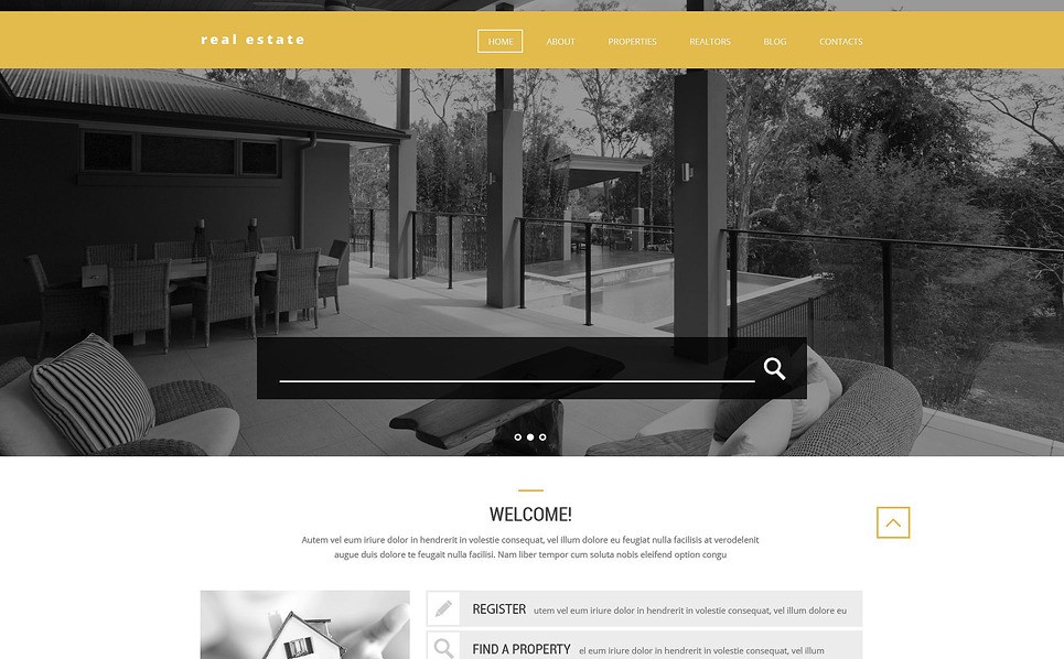
Source: http://www.templatemonster.com/wordpress-themes/53383.html
Add some color to the menu and buttons, and you will give your clients a clear direction of where to go.
Text positioning
Lined up texts are always nice for users’ eyes. But as well as they are nice they’re also boring. The standard header and menu will be user-friendly for your clients but they won’t catch the user’s eye.
We can learn from the better old websites where the content menu was sometimes not in the header at all, and adjust the menu in the unusual place. That will make your website interesting and eye-cathing even in the not so pop spheres as in the Religious templates.
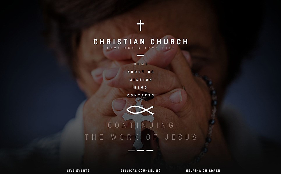
Source: http://www.templatemonster.com/wordpress-themes/53387.html
By shunning traditional rules the vertical menu will draw the attention of web users to the content you need.
Simple code
We all think that flat design indicates simplicity, but sometimes it doesn’t. Web developers now work a lot with CSS and make more and more templates with the overloaded content structure. The thing they forget is the simpler – the better. And sometimes a simple image and one text column are enough.
So what should you do?
Re-learn the basics of web design and use what you found out for your purposes. Try something new, or in this case, the well-forgotten old and you will catch the client’s eye. People will get bored with the flat websites that look the same. Use the techniques that are popular now, but do it your way. Consider to use some old trends, as we all know, people tend to come back to the old preferences.
About Irene Fatyanova:
Irene Fatyanova is a content writer, working with TechnicalMindsWeb.Com who loves reporting on the latest web design and online marketing trends, WordPress and eCommerce solutions. Apart from writing tech articles, she’s keen on photography and has a couple of cool Photoshop image retouching tricks up her sleeve.


