
Here are some tips to help design your website more mobile friendly and responsive for different devices.
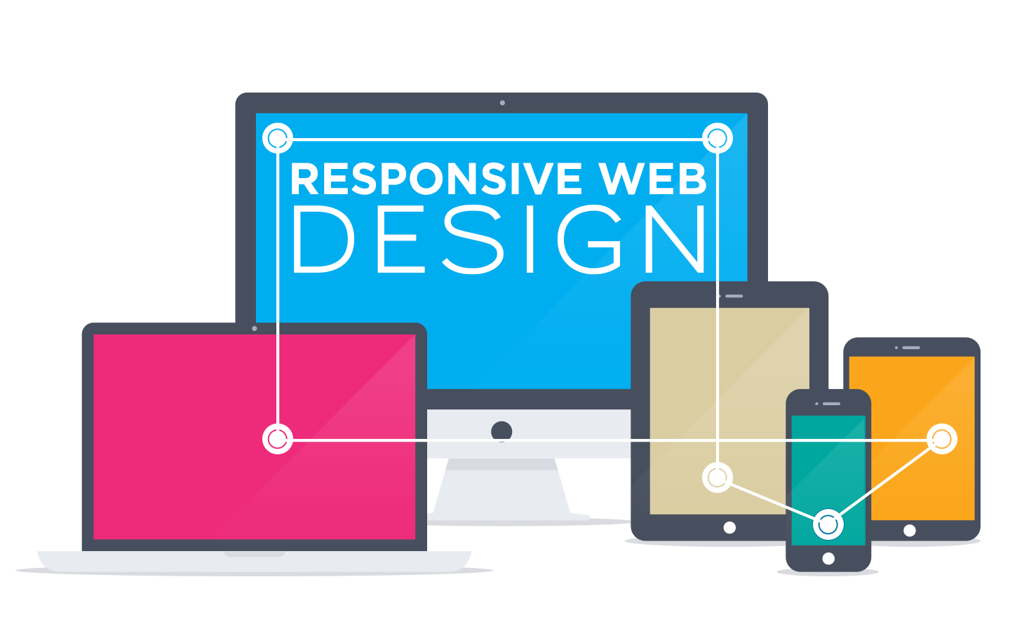
What is Responsive Web Design?
Responsive web design means that the pages on your website will adjust automatically to the resolution and size of the screen of the visitor, regardless of whether they are using a PC, laptop, tablet or a mobile. Having a mobile friendly website has become extremely important over the last few years, as more and more people surf the net via their mobile or tablet whilst they are on the move, or even when they are static, simply because it is quick and easy to do so.
Of course, this development means that the savvy business website also has to be capable of giving the visitor the same attractive, easily navigable images and information for both traditional internet surfing on a PC and for the increasingly common mobile device. In fact, a responsive design has to build in the adaptability to adjust automatically to the most common three different screen sizes.
Whilst it is possible to develop different websites for different devices, this is far from an ideal solution. Having a responsive web design means that one “size” of website can be used for the three different screen sizes currently in use and – who knows – will be easier to adapt again to whatever developments future technologies will bring. The all-singing/all dancing wrist watch of science fiction may become the next “must have” for future generations.
What can I do to make My Website more Mobile Friendly?
We all surf the web every day and it could pay to take a critical look at the sites we visit most often to analyse what it is about those sites that attracts us. Is it just the items on sale, or is it the clarity of the information and ease of navigation? Being aware of the factors that contribute to the popularity of the best responsive sites can help in adapting your own.

The first thing to consider, therefore, is to make the web design as clear and uncluttered as possible so that there is less chance of confusion, either about specific information on the site or about navigating your way around it. How, in practice, can we do this in terms of design, to make the website more mobile friendly for visitors?
Some Tips to help with Responsive Web Design
- The last thing people surfing the net via a mobile device want is to have to try to negotiate their way through a series of tiny icons; they are generally scrolling down or across the page, as this is far easier with the design of smaller screens. This can be incorporated into your responsive website design, so that the website adapts automatically to the most user-friendly version, depending on whether the device is a phone, tablet or PC.
- If you already have a really attractive image or logo, continue to make the most of it for marketing purposes. If you specify that it should be 100% wide, rather than a fixed width, then this will allow it to shrink for smaller screens, but retain its impact. Just one thing – the text has to be kept large enough so that it is still possible to read it on mobile devices!
- Don’t change the template for different pages of the website. Remember that visitors, especially when using phones, can only see a small part of a page at a time, so will find it easier if the same menus an template are used everywhere.
- Think about possible ways to reduce the number of clicks for mobile users, which could include more emphasis on the home page, or clever use of overlays and lightboxes.
- Give careful consideration to your colour schemes; too much colour can distract attention from the important information you want the visitor to see.
- Some phones, such as Apple, won’t display Flash animations, so you can overcome this potential problem by showing an image instead. Similarly, JavaScript can be used rather than Flash slideshows or other menus, so that every visitor is able to view what you want them to view.
Being mobile friendly is essential for modern business websites and you can find more information from 1 Website Designer on making your website one of the best responsive sites.
Hopefully this has given some initial ideas on adapting to responsive web design to ensure your website is mobile friendly and your customer base continues to grow.


