
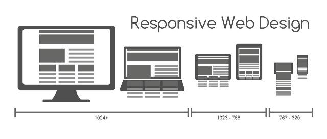
Responsive design is becoming more and more popular as a trend for website development. It is the right time to ask yourself how this new standard in website development can improve your online presence? In this article we will take a look at responsive design, highlighting its advantages, but also mentioning some of the most common problems with responsive design.
Pros: One website for all devices
The main advantage of responsive design is its convenience. You no longer need to create a unique website design for each device separately. Responsive design takes into consideration the width of the browser window when displaying the content of the website, which means that responsive design can be easily adapted to all mobile devices, including the new smartphones and the models yet to come.
Cons: Redesigning your website to meet the new demands
Switching to responsive design means that you need to redesign also your desktop website, ripping the old version into pieces and starting anew. This can take some time, although the good news is that you have to do it only once, while mobile templates require constant improvements and new designs for the new types of smartphones.
Pros: SEO friendly design
Responsive design allows you to manage your search engine optimization campaign with much ease, since you no longer have to create separate strategies for mobile and desktop devices. One website means one URL – a solution much preferred by Google and its crawlers, which scan the website looking for specific information.
Therefore, switching to responsive design can not only decrease the costs of SEO campaign, but it can also increase the efficiency of your SEO strategy in Google search engine.
Cons: Website specific SEO can be more effective
Research studies show that people often use different phrases when they look for products or services via different platforms. For example, mobile phone users are more eager to use terms such as “nearby”, while desktop users tend to type in the name of their current location if they are looking for services near them.

It means that search engine optimization campaign designed specifically for mobile phones can be more effective, taking into consideration different habits of mobile and desktop platform users.
Pros: Improved customer experience
Companies, which use mobile templates to create mobile specific websites often decide to strip off all unnecessary content, leaving only a simple and quick to load, but often unattractive for the customer website.
With responsive design you no longer have to worry about a different look of your mobile and desktop website and you do not have to wonder whether your website loads accurately on mobile devices or not. Responsive design allows you to have fully functional and almost identical desktop and mobile websites.
Cons: Problems with downloading images
Mobile devices and desktop computers provide their users with different types of internet experience. Mobile devices typically offer access to limited bandwidth internet. One website for all devices means that a rich design full of high resolution pictures, which loads very quickly on desktop computers, suddenly becomes difficult to use on mobile devices. This is something responsive design fans have to watch out for.
Written by Marta Gromadzka, a blogger, a copywriter, a marketing specialist.


