
On the basis of recent surveys, it is reckoned that the mobile internet users will outgrow the desktop users within next two approaching years. The rapid upgrade of mobile internet has empowered more and more people to rely on their mobile devices as their primary tool for browsing the web. What does it imply for web development? The traditional development for certain screen resolutions is already going out-of-date.
Most of the businesses have acknowledged the fact that the trend of mobile is new and up. Having a mobile and responsive website will not only leave a good impression on visitors; it is, in fact, a new way of improving conversion rates and keeping your visitors engaged.
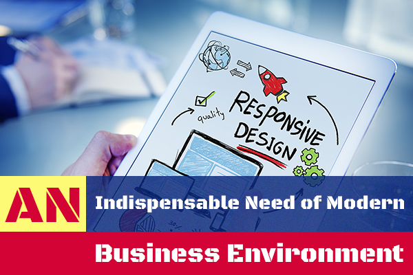
You might be perplexed about taking the first step. Well, responsive design is not a big mystery that you might have imagined. Let’s just understand this term first before moving on to the discussion of any other aspect. Responsive design is a stratagem that enables a designer to build a web page that will get resized itself depending upon the screen size of the devices it is being viewed upon – be it a large sized desktop, a 10 inch tablet, or a 5-inch smartphone.
The need of a responsive design is still a question to many. Well, this could be understood more clearly with the help of an instance. Let’s consider a conventional website that comprises fixed elements. When observed on a desktop computer, you could see three columns on that website (Keeping as an assumption). But when you observe the same on a smaller smartphone, you might feel forced to scroll it horizontally or to undergo a time-consuming process that generally users don’t like to do. The next issue that could worsen your experience is the distorted things you will get to view on the website after waiting so long. Blaming the advanced technology that enabled portrait or landscape views on a smart phone is simply not right here.
It is an agreeable fact that viewing a fixed website on a small screen phone is no less than a challenge. The break in layout due to large images or slow speed due to heavy graphics tends to be most irritating. Nevertheless, if a responsive web design has been used, the smartphone or any other mobile device might automatically adjust for displaying an appropriate number of columns as per the space available. Instead of distorted one, you will get to see a well-organised layout with clearly listed contents.
Coming to the functionality, responsive sites make use of flexible grids. Every page element is sized proportion instead of pixels. So, if you want to integrate three columns, you shouldn’t specify the wideness, you should rather specify the wideness in respect to other columns. For example – Column 1 should consume 20% of the screen while column 2 and 3 should consume 40% each. Similar will be the procedure with images, tables or other content you want to display on your website.
The demand of responsive web design tends to rise higher with the time as tech sector is continuously bringing on the new devices, liaised with advanced capabilities and limitations. But this is something inevitability pushing the level of challenges to web designers a notch higher. One of the crucial points to be focussed in such designs is the navigation and one of the latest developments can be witnessed in the technology of wearables. The input method is controlled through sensors that track every movement so rapidly, enhancing user’s experience. There are a lot more things that add to the demand of a responsive design.
Conclusion: If you want to provide your users a delightful experience so that they will enjoy exploring products and services on your website, you should consider making design responsive. More will be the responsiveness in your website; better will be the user engagement and higher will be the conversion rates.
Author Bio
The author, Kristy Bernales, is working as head web page designer Melbourne at webdesignxperts.com.au. She shared this post especially for growing businesses’ who have long-term goals, introducing them to the new and uprising trend of responsive design that would not help enhancing the visitor’s experience, but can also help achieving the conversion objective within estimated time period. You can connect with Kristy on Twitter & FB.


